- Services
- Dynamic Captions
- Animated Avatars
- BWT Videos
- ChatBot Agents

AI ChatbotsSupport more customers with a friendly greeting and helpful chatbot agent.
- Chatbots Category
- Video Editing
A Picture Is Worth A Thousand Words - The 5 Cs of Quality +1 How To Evaluate Images


A simple yet effective strategy to identify with the viewers and encourage them to do something are the 5 C's of quality. Apply them to boost the value of your images.
Get The Big Picture
The 5 C's of Picture Quality + 1 New 'C'
 The colors should compliment each other well. Red, green and blue are called the primary colors. Colors are additive meaning if you mix them they will make a different color i.e. green and red makes yellow.
The secondary colors include cyan and magenta and yellow. If you want something to blend in use complimentary colors, like pink and red. If you want something to stand out use contrasting colors, like blue and yellow.
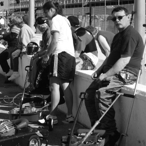 Contrast is the level of black to white components in an image. Even color images have a light to dark conponents. There should be a balance of light to dark areas in your picture. This determines the mood of an image. You may have heard the terms "dark and moody" or "light and airy" used to describe a picture.
Too little contrast and the picture looks washed out. Too much contrast and the image looks harsh. Either way the level and range of the contrast sets the mood of the image. For instance dark blue, red or purple set a dark mood while lavender or pink are brighter, yet the basic colors are the same.
The formula for contrast ratio is equal to the widest separation in amplitude from white to black. With white being all colors combined and black being no color at all. On a range of 0-100, black is 0, and white is 100. Every integer between 1-99 is a shade of grey.
Color occurs when different amounts of the primary colors (red, green and blue) are added together, or varying amount of secondary colors (yellow, cyan and magenta) are added to gether.
Think of 'light and airy' mood as colors nearer to white. 'Dark and moody' are colors nearer to black. Pink for instance is 100% red + 90% blue and 90% green. Brown is 30% red plus 10% green and 10% blue. Yellow is bright because it is 100% Red and Blue with no green at all.
 Clarity is the sharpness of the content. Out of focus images are not necessarily bad, but generally the sharper the focus the more clarity. You need to evaluate the whole image not just the good looking guy.
You may want something to stick out inside your picture or just use it as a reinforcement for your words. Suppose your message isn't real clear. In this case you may want to soften your image and sharpen your words.
Clarity can be enhanced by having varying focus in the shot, as focus can be adjusted. Called the focal range. Where some objects may be 'in focus' while background objects may be out of focus. This draws attention to the 'in focus' part on the image.
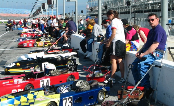
What's wrong with this picture? It breaks all the rules
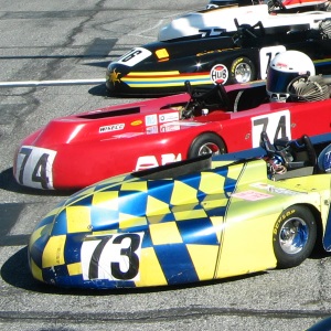
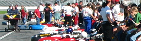
There are 3 main shot types for images, the close up, medium shot and the wide shot. A close up has one main object that fills the screen. A wide shot includes many objects that are near or distant as well as a main object. A medium shot is between a close up and a wide shot.
Different elements in an image can point to or away from the primary focus of an image. Try to orient the image to enhance your main object whether close up or far away.
On this page all images are either 300 pixels or 600 pixels wide. All the 300px wide images are also 300px in height as well. This makes these images perfectly square. Which means they will scale without any distortion.
 Continuity means how well each component fits in with the context of the overall page. If you have a series of images on a page they should compliment each other.
When using a series of images try not to mix different themes, colors, contrast ratios or sizes without prior planning. With planning you will achieve the added value of continuity. Without planning your images portray a sense of chaos.
Spacing is also very important. Make sure your images have plenty of space around them. Images that appear forced into a small space can detract from the effect.
Shape can also affect the overal effect of the image. Try to fill the intended space as opposed to trying to make an ill fit. Crop an image if need be. Avoid trying to resize an image to make it fit will lose clarity due to lower resolution.
 Mobile devices added a whole new 'C' to picture quality "Compatibility." Mobile device compatibility requires images to be scaled to fit the screen they are displayed on.
There are tricks to making images scale to the screen size they are displayed on. Problems with scaling is resolution degredation when an image is scaled to far.
Some graphics scale real well while others don't. If you run into resolution issues it is best to create a new image with higher resolution that more closely fits the space (screen size) you are trying to fill.
Notice the image on the left is cropped to fit the screen size, rather than scaled down.
These are usually yes and no questions. Think about each question in turn. Then look at the big picture and answer the questions again with your conclusions added.
To sum up when composing your art work ask yourself this question "does it pass the 5 C's?" If you answer no to any of them you will need to change something. When you can answer yes to all the questions you know you have a well balanced picture worth a thousand words.
Hope This helps
Tim
Home : Easy Blogs Tutorials : picture

61 W. Annabelle Ave. Hazel Park,
MI. 48030-1103, U.S.A.
telephone: (248)546-0374
email: support@best-website-tools.com
© Copyright 2007-2026 All rights Reserved.
Sun: closed
Mon-Fri: 9:00AM to 6:00PM
Sat: 9AM-12:00PM
Closed Holidays
