- Services
- Animated Avatars
- BWT Videos
- ChatBot Agents

AI ChatbotsDelight more customers with a friendly greeting and helpful chatbot agent.
- Chatbots Category
- Video Editing
- Animated Avatars
Template For Websites BB2 vs. EasyBlogs Transition Tips 2018-07-19
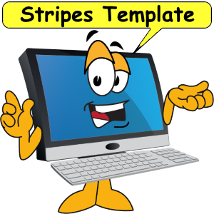

The main look fo this template is full width. It will fill any screen side to side. Alternating stripes give it a more contained feel. Notice the different stripes identify different areas of a page.
The Challenge And The Solution
We joined a challenge called "Revitalize Your Site Challenge - Week 2: Switching to BlockBuilder 2" In this challenge participants are invited to upgrade their website to "BlockBuilder2" (BB2) BWT (that's us) selected the "Stripes" responsive template called "Techly." The real challenge for BWT is to show how our offline built websites can be interchanged with our host's online website builder. The solution is to build the template in BB2 then transition it to EasyBlogs.
Stripes Responsive Template in Solo Build It
Solo Build It (SBI) is the hosting platform for this website. SBI is an all in one buisness buiding platform. Not just a website builder SBI teaches you how to successfully operate an online business.SBI contains over 100 different templates designed for different niches. There are designs for "health and beauty. high tech, books and art, business and finance and many more.
Also in the template gallery are several 1, 2 and 3 column custom templates. Not everyone will completely love a particular template. So SBI has a fabulous site designer tool you can use to customize your site to perfection.
Stripes Template In EasyBlogs
The goal of this exercise is to have a template originate in BB2 and then transformed to EasyBlogs (EB). EB is the blogging software used for the RSS feed and blogging platform. SBI makes this easy with the downloadable "TransitionTemplate.zip" tool.Transitioning from (or to) BB2 and EB takes a little work and some knowledge of webpage creation. For the most part source coding and content areas are separated in both platforms. This means the non-technically oriented webmasters can concentrate on creating content and skip the techie stuff. While the techie types can enjoy building outstanding designs with ease.
Responsive Grid In BlockBuilder2 2018-07-20
the resonsive grid element
Driver Tim Koen Owner Terry Koen

Battling for the lead

Event: Champoinship Enduro Series:
Race #4: Controlled Limited.
Location: Grattan Raceway.
TeamKoen racing motors
I love the responsive grid example shown above. All the sizing and fitting are done in the BlockBuilder2 editor. Simply drop in a 'Responsive Grid' and the fill it with images. In the example above each image is re-sized to about 33% then shown side by side. As the screensize shrinks the image size shrinks as well.
This intuitive element figured out how to make anything fit. Here's how: the overall container is set to be 100% wide. This grid is only three divisions. So, each division is set to be 33% wide. Then the 3 divs are set in a row. Thereby any screensize will display properly.
Text and headlines are also 'fit' into each div. For the webmaster this takes simple to the next level. Now with the drag and drop tools in BB2 one can design without needing to know the math or manipulating image size. Just drag, drop and voila' instant grids that are mobile friendly.
Test 2018-07-27
Mobile App Maker Interactive Editor Simulator 2018-07-30
 The Mobile App Maker is an interactive editor/simulator development platform to design, build and publish mobile apps. Create apps for Amazon Kindle, the Apple App Store, Google Play and Progressive Web Apps (for websites). Easy to use visual editor follows a 5 step process. 1. Select a template. 2. Edit and configure the app. 3. Preview on your device. 4. Publish to the app stores or on your website. 5. Sign in and pay.
Step 1 Select a template. We offer several templates to choose from for just about every marketing niche. We also include "blank" templates to cover every custom application you might think of. We recommend starting with a blank template because Apple is very strict about accepting duplicate template designs. With a blank template you can add the pagetypes you need to achieve a truly custom unique mobile app.
Why Miappmaker? Because our low prices allow you to build your own mobile app. No need to pay expensive developers when you can do it yourself. Check it out...
June 2018 « » August 2018
Home : Website Tips


61 W. Annabelle Ave. Hazel Park,
MI. 48030-1103, U.S.A.
telephone: (248)546-0374
email: support@best-website-tools.com
© Copyright 2007-2024 All rights Reserved.
Sun: closed
Mon-Fri: 9:00AM to 6PM
Sat: 9AM-12:00PM
Closed Holidays
