Accordion Boxes Made Easy software and tutorial. Create animated dropdown panels to show or hide content. Make long pages shorter and more interesting.
Accordion Boxes Made Easy Software And Tutorial Kit Show / Hide Content To Make Web Pages Easier To Read
So, you made this great website page, put your heart into it. You've described in minute detail how well your idea can solve a problem. Only to realize... nobody is reading your page.
The problem may be that the page is too long and/or too boring to engage the user completely.
Your content may be boring. Visitors love to skip over paragraphs and skim through a page. If they like what they see they might go back to read the rest of the page. Accordion boxes make your page more interesting. They can engage the reader with a little fun.
Accordion boxes use animation to show/hide content making pages shorter and more interesting. Click on a title to open/close the content panel. Engage users longer, improve click through rate, time on page and bounce rate.
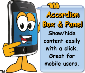
Collapsible box shows/hides content with a click. Great for including more info and saving space at the same time.
Can be used on any text, image or button and is mobile responsive. All components are included in the kit. Check it out!
$29.97Our Price $9.97
How Accordion Boxes Work
With this cool tool users can expand/collapse a responsive content boxes. You can structure accordion boxes to create a library, a menu or an e-store. Generate a sense of fun in your page with organized content. Users instantly get a feeling of satisfaction knowing they can control the virtual reality.
Create dropdown like accordion boxes with text links, images or fancy buttons. This code works on any element and is mobile responsive. Made Easy tutorial explains how to incorporate them into your website. Basically you include jQuery and the A-B javascript into your page. Then use standard html to create the content. Pre-made box templates are included in the kit. Easily copy/paste the raw html into you page. Then simply add your content to the box.
It is fun to open and close the boxes. With this tool a webmaster can engage their audience much faster and for a longer time. Hide boring content and make it look cool at the same time. Give your visitors a sense of fun. They want to see the hidden content. And they will explore to see what treasures are underneath.
With the growing mobile device usage long webpages tend to be too much information for the user. With an accordion box a webpage can be shortened to something a mobile user can quickly scan.
Did I mention that Accordion Boxes are mobile responsive? You bet, that is what sets these boxes apart from others. You still have to layout your content with mobile in mind.
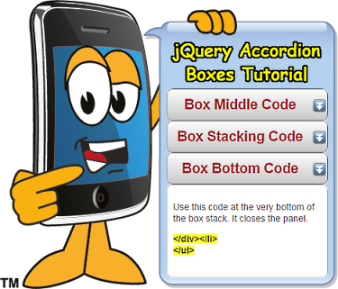
This code goes between the control and panel boxes.
</a>
</div>
<div class="accordion-panel">
Your main content goes here. Meaning below this code chunk and above the next. Which could be either the 'Stacking' or 'Bottom' code chunk.
As you can see from this page you can squeeze a lot of information into a small space. However the idea is not to put too much info in the panel boxes. Instead use another accordion box.
You need 2 javascript files and this html code to make a 2 button stack.
jquery-1.11.0.min.js
accordion.js
Basic HTML code structure:
<div class="accordion">
<div class="accordion-title">
<a href="#"><h2>Title</h2></a></div>
<div class="accordion-panel"> Replace this with your content.
</div>
<div class="accordion-title"<a href="#"><h2>Title</h2></a></div>
<div class="accordion-panel"> Replace this with your content.
</div>
</div>
The action, when clicked on uses the 'slideToggle' function in jQuery. The accordion.js is a simple program that controls the show/hide function of the panel. The actual code analysis is beyond the scope of this article. Let's just say it provides the animation of the accordion box.
A-Boxes allow for styling the title box and content panels. You could stack as many as you want but only need to add the javascript files once per page. You can have just one item or many or many of them.
To use on a Solo Build It BB2 page, use a 'reusable block' to hold the html code chunks. You will need 4 reusable blocks. For uploading to your site, simply copy and paste the HTML and CSS code (shown below) into your page. All detailed in the Made Easy Tutorial.
Accordion-box CSS style have slightly rounded corner, a light gray background and a box shadow. Modern browsers show a light gray gradient. When a mouse is hovered over the the button, box shadow switches to inside the box. This gives the affect of being pushed. Contact me for help developing your own styles.
All button and box styles are found in the accordion-boxes.css file included in the kit. The code is well commented inside the included ebook. Best practices for modifying the code are reviewed.
Accordion-btn CSS style has medium sized rounded corners all around. It also has a light gray background with modern browsers showing a gradient instead. When hovered over the included text expands slightly and a n underline is added to the link. This gives the affect of the button popping up just a little bit.
btn-inner class creates the outline around the drop down panel. It contains a 1 px border which is a medium gray with rounded corners. The outline is responsive to the content inside. Works great on desktops and mobile devices.
btn-inner must be used in conjunction with accordion-panel class.
Inner-btn CSS style has medium sized rounded corners and switches the box shadow from outer to inside the button. It has a transparent background that switches to a light yellow when hovered over.
To make the boxes look awesome add some styling code to your css. Then modify the 'accordion-title' or 'accordion-panel' or 'div' tags.
I used a light grey box with rounded corners for the control box. So my code looks like this: <div class="accordion-title accordion-box">
I added this code to my css file. Then added the CSS tag to my source code. To add this to a webpage only you need to include the source code in between the <style>...</style> tags in the head section of the page.
You can make up any style rules you like and add them to the 'title' or panel box
tags. We show you how in the kit.
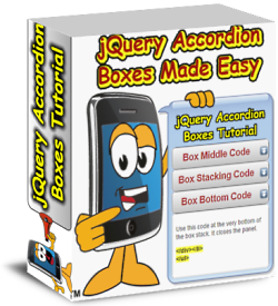
Accordion Boxes Made Easy Software and Tutorial Kit
Step by step tutorial to animate show / hide content boxes.

 So, you made this great website page, put your heart into it. You've described in minute detail how well your idea can solve a problem. Only to realize... nobody is reading your page.
 Collapsible box shows/hides content with a click. Great for including more info and saving space at the same time.
Can be used on any text, image or button and is mobile responsive. All components are included in the kit. Check it out!
Collapsible box shows/hides content with a click. Great for including more info and saving space at the same time.
Can be used on any text, image or button and is mobile responsive. All components are included in the kit. Check it out!
 It is fun to open and close the boxes. With this tool a webmaster can engage their audience much faster and for a longer time. Hide boring content and make it look cool at the same time. Give your visitors a sense of fun. They want to see the hidden content. And they will explore to see what treasures are underneath.
 You need to include these javascript codes on your page (or website). You want to add this right before the closing
 Icons and images can be added to the title and panel boxes. Use typical styling techniques like 'float:left' or align="right" to locate it properly.


